When Less is More
Minnesota Youth Ski League (MYSL), an organization that teaches cross country skiing to kids and their parents, knew they wanted an updated website design to coincide with their pending migration to a new CMS. But as a teeming, multi-state organization run by nearly 1,000 volunteers, MYSL had had something more than a website—they had a sprawling resource that had long outgrown the bounds of the blogging platform on which it had been built. Upon learning that users had less ambitious needs, my team proposed a radically new direction to slim down the site while drawing more users in.
Roles: Research, Strategy
Methods: Content Audit, Comparative Analysis, Remote User Testing, Architecture Mapping, Journey Mapping, User Survey, Card Sorting, Prototyping
Tools: Pen & Paper, G Suite, Zoom, InVision, Miro, Figma, Optimal Workshop
The Big Picture
Client
Minnesota Youth Ski League:
Club-based nonprofit youth and family cross country skiing program.
Project
Redesign website and developing a new architecture plan to improve usability and connect users more fully with organization values.
Recommendation
Pare down scope of website and implement new content strategy to focus on primary user goals and simplify navigation.
Understanding the Scope
Meeting with stakeholders and conducting user tests showed us that we had more than just a simple website redesign on our hands.
When my team met with stakeholders from MYSL, we were struck by the breadth of their organization: 3,000 participants, 1,000 volunteers, over 40 member clubs across 3 states, and only 2 paid staff. To meet the needs of such an expansive agency, MYSL had turned their website into something akin to an enterprise tool designed both for external and internal users.
It was an impressive feat for an organization relying almost solely on out-of-the-box solutions, but the website had turned into a navigational challenge for users. MYSL knew that people struggled to find what they needed, but had limited insight into exactly where the experience was breaking down.
As my team began our research, a pattern emerged. Not only was navigation difficult, but people simply weren’t connecting with the site as a resource. Navigation, as it turned out, was only part of the struggle.
At our early stakeholder meeting, our team got a look at the complex inner workings of the MYSL website and its many features and functions.
“There is so much information on the homepage I never know how to find what I'm looking for.”
— User survey response describing the challenge of navigating the MYSL website
To show the disconnect between user needs and flows both to and within the website, I developed a resource map. While it did not immediately drive us to a solution, it gave the team a common framework from which to understand the problem.
Mapping Out the Problem
Even as the team began prototyping a solution, we struggled to put our finger on the problem we were trying to solve.
After conducting an initial round of research, my team quickly dove into prototyping possible solutions. I was concerned, though, that we hadn’t yet hit on the over-arching problem. We knew the architecture and navigation needed tweaking, but there was something else bothering me.
As I tried to map out the existing user journey through key workflows, I was finding dead ends—places where the connection between the users’ questions and the answers dropped off altogether.
I brought up my concern with the team. It sparked a conversation about whether or not a new architecture plan inside an attractive wrapper was the right way to go.

Users told us that they wanted the MYSL website to do a few relatively simple things for them. They had also shown us that, as busy and active parents of busy and active kids, time to browse was precious and limited.
What if, we started to consider, we just got rid of all the content that slowed them down? If the website were reimagined as a resource for parents rather than a resource for the organization, what would happen?
Building a Simpler Plan
Approaching a dramatically different solution meant starting from scratch and gaining a new understanding of how users would move through the website.
Having met with the stakeholder and, after some weighing of pros and cons, earned their approval for a leaner site plan, the team started to wireframe a new online environment for MYSL. While settling on a visual style was smooth, understanding the internal navigation presented another challenge.
After spinning our wheels on layouts and page content based on the updated architecture plan, I took a step back and instead plotted out how users would look for and absorb the content we were trying to organize. Then, I created a wireflow to depict that horizontal movement across the site rather than vertically through the main navigation.
When paired with the architecture diagram, it was the visual cue the team needed to coalesce around a content plan and begin building our prototype with confidence and a clear direction.
A low-fidelity wireflow that I made to help the team see how the layouts and content strategy would drive user flows between different sections within the overall architecture.
“It might be [when] I’m in the living room and keeping an eye on the kids. . . It’s pretty sporadic and whenever I can find a free moment.”
— Potential user describing her experience doing online research on activities for her MYSL-aged child
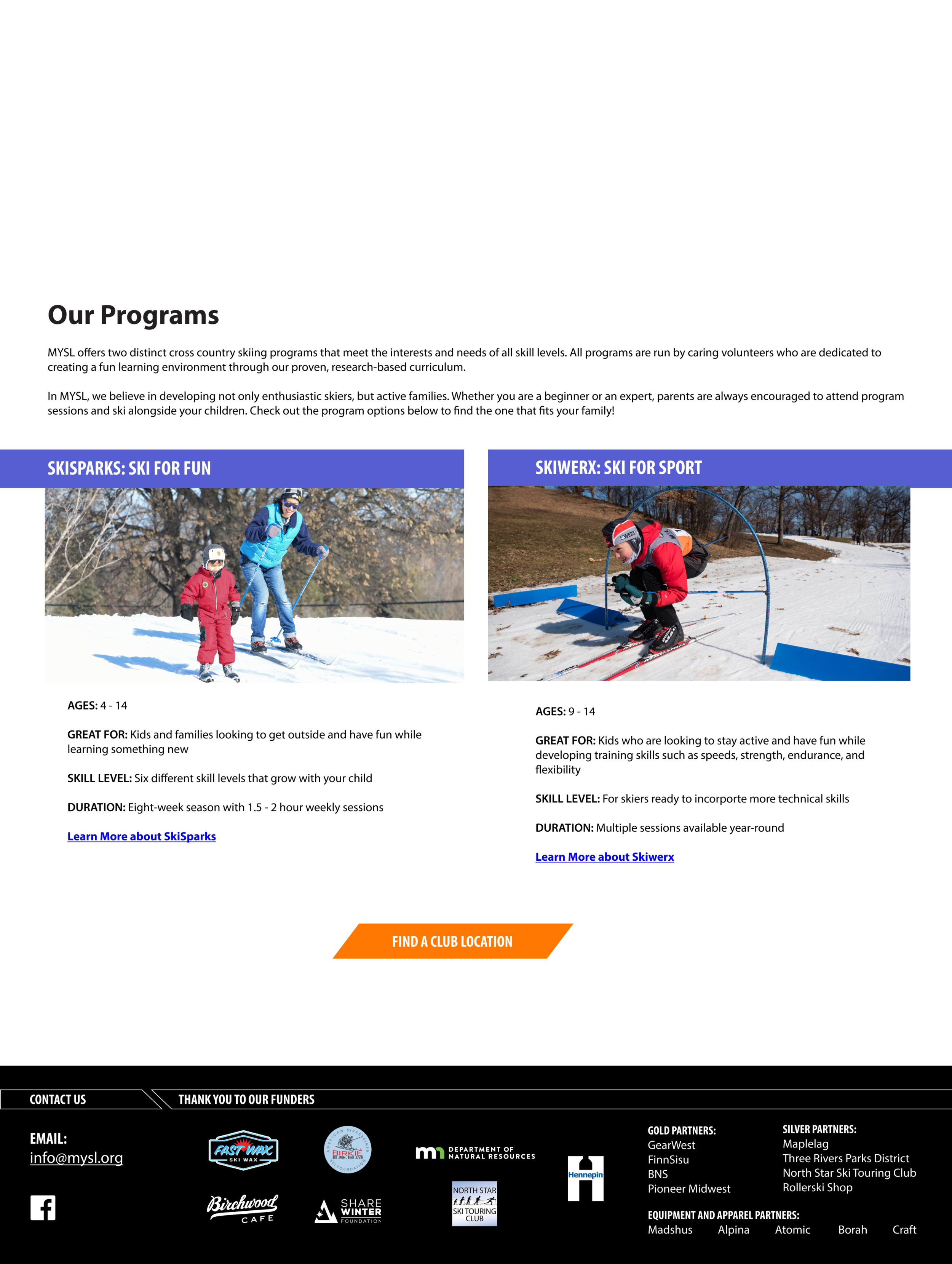
Selected pages from the updated website showing the content strategy at work, emphasizing brevity, scannable information, and the parent/child connection.
Bringing the Plan to Life
With user tests confirming the direction of our navigation plan and content strategy, we moved into high-fidelity prototyping.
Further user testing with a low-fidelity prototype affirmed the general direction of our navigation plan and delivered new insights into how the reimagined website would impact both seasoned and novice users. For this second round of testing, I also developed a card sorting activity to bring clarity around the photography plan I was developing.
Moving on into high-fidelity prototyping, we began to focus more on how the content strategy would play out in application, especially for newer users.
To ease the stress on already distracted parents, we edited copy for brevity and introduced more scannable headers.
In response to MYSL’s emphasis on diversity, inclusion, and outreach, we focused on making content approachable for users of all backgrounds by limiting ski-specific terminology and providing helpful context and links to more information where possible.

In producing a content strategy guide and examples through our prototypes, I placed particular emphasis on connecting MYSL’s values with the needs and interests of the parent decision-makers who represented the website’s primary user base.
MYSL wanted to help users understand skiing not just as an athletic pursuit, but as a recreational activity that families could enjoy together. By emphasizing the parent/child connection at multiple points along the users path, we brought the website into greater alignment with MYSL’s values while allowing parents to see themselves and their families in the organization’s story.
Inspiring a New Vision
Sharing our work with the stakeholder and showing how a leaner website could actually convey more to their users helped them to appreciate the potential of the new direction.
While my team focused on a high-fidelity prototype of the website, I focused on completing the content strategy guide. I saw the guide as a bridge between our vision for what the MYSL online experience could be and the final product after a new CMS was selected. As a small organization with a limited budget, the resources to replicate the UI or some of the features precisely would be limited, but the content strategy guide would provide solutions that could be effective in any context.
That focus on content as well as design and architecture proved to be useful, as MYSL was able to introduce small, short-term content changes ahead of the larger and more intensive CMS shift and redesign. Those changes would help users more effectively use the site during the imminent ski season, even before design changes could be implemented.
As MYSL looks toward the next steps in revitalizing their online home, they know that everything may not be feasible—at least not in the short term. But seeing the possibilities for themselves, they can move forward with a clear goal and vision.
Watch the team share our work in an online presentation.
The Takeaway
It’s a common tale: losing our focus in the valiant effort to to satisfy everyone. Often it takes a fresh set of eyes to see it. Inevitably it takes compassion and genuine belief in the goal to articulate it and suggest a different way.
Knowing who our users are and listening to their needs might take work for a design team, but it takes a leap of faith for a client who has lived and breathed the world we are passing through for only a short time. Remembering where we are trying to go, telling the story through the user’s eyes, and being on the same team as the people we are serving makes the leap look just a bit less daunting.

