Keeping the “Well” in Wellness
Do a quick search of the phrase “health and wellness” in your preferred app store and you will get hundreds of results. Choose one at random and it may be a tool for on guided meditation, step tracking, or yoga. The images may include photos of chiseled abs or serene beaches. The headlines may promise to help users manage weight or even cope with mood disorders. But what happens when these “healthy” apps lead their users to unhealthy habits?
Through conversations with users, I uncovered a gap in the way some popular apps in this booming space communicate with their users. . . gaps that could lead to unintended results. Their stories served as the catalyst for a new mobile wellness app concept that seeks to eliminate those negative impacts through intentional design.
Roles: Research, Design
Methods: Directed Storytelling, Remote Usability Testing, Architecture Diagramming, Affinity Diagramming, Wireframing, Prototyping
Tools: Sketch, Axure, Zoom, Pen & Paper
The Big Picture
Concept
A holistic health and wellness app for young, health-conscious women.
User Need
Allow broad access to health resources and tracking without promoting negative or shaming behaviors.
Solution
Track data in a way that demonstrates progress and commitment without providing opportunities for comparison.
Uncovering the Problem
Before I could even identify the opportunities and challenges in the world of health and wellness apps, I had to do some research. This research took the form of a series of directed storytelling sessions with three frequent users of digital health and wellness tools. Through affinity diagramming of participants’ experiences and motivations as revealed in these conversations, several key patterns began to emerge. Most compellingly, all three participants cited that they had used wellness apps at the recommendation or under the guidance of a healthcare professional. Astonishingly, however, two of three participants had been told by their provider NOT to use those apps as they were designed due to potential negative mental health impacts. Furthermore, despite all being active wellness app users, there was unanimous disappointment among participants that weight loss was the primary motivational technique employed by these apps.
Affinity diagram of participant pain points during initial research. All three participants felt strongly that their use of apps to track food intake and activity relied heavily on weight-based goal setting that did not meet their needs and even led to feelings of anxiety or shaming.
“You’re a bad person now. We’ll help make you a
good person.”
— Participant describing her feelings about the messaging of mobile health and wellness apps
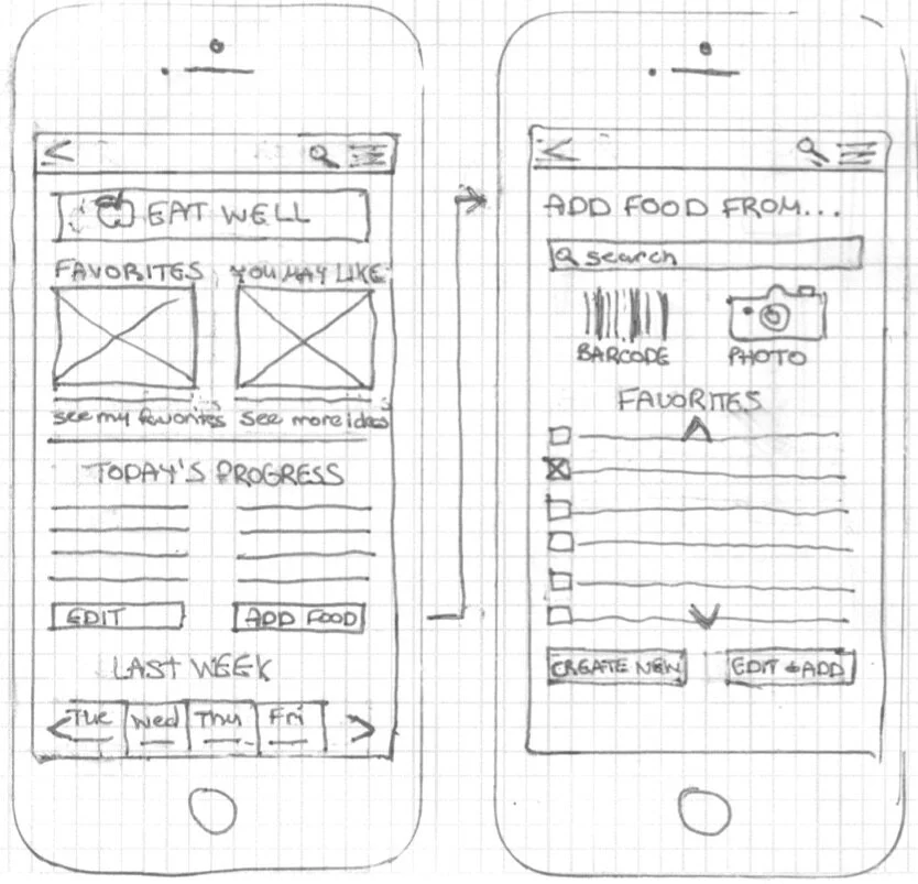
Early hand sketched wireframes of key screen layouts. On the left is my first idea for a main nutrition screen that would offer a digital recipe book of user favorites, new recipe ideas based on their tastes, and a customizable nutrition tracker. On the right is a screen that gives the user a number of options for how to add nutrition information. Since research participants were unanimous in their desire for easy and quick ways to update their trackers, it was important to include a number of fast entry options that would be easy to use.
Designing a Solution
In order to start tackling the problem of wellness apps that turn out to be wellness saboteurs in disguise, I developed a user statement inspired by the three women who had shared their stories with me during initial research. That user statement would direct and focus the design process moving forward:
My user group is young, health-conscious women who want a flexible, holistic, and positive resource to help them feel their personal best physically and mentally.
Having identified the user, next I hand sketched wireframes of several key screens to play with ideas for layout and content that would offer both the functionality and results the user group wanted. With a few screens laid out on paper, I translated and expanded on those sketches with digital wireframes.
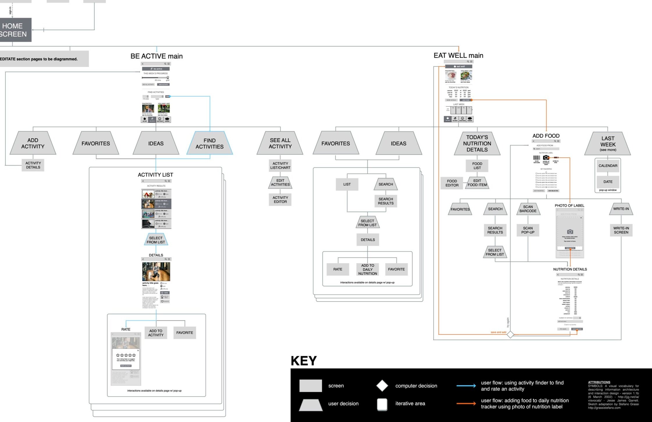
These wireframes served as inspiration for an architecture diagram of key sections of the app.

The user flows were designed to allow users to easily access as few or as many features of the app as they wish. Data tracking points were separated — both architecturally and mathematically — to encourage the user to treat each goal as its own opportunity for achievement rather than a benchmark for success or failure in other areas.
Updated wireframes for the Home screen (left) and for adding nutrition information (right). I included a sticky navigation footer on all screens. rather than just main landing screens, to facilitate easy movement throughout the app at all times, as well as a quick and easy mood tracker on the main screen to encourage daily mindfulness and self-awareness for all users. I also added a write-in option for adding nutrition information to clarify that users are always in the driver’s seat controlling the accuracy of their information.
Working Out* the Kinks
*pun intended
After creating the app’s architecture, I discovered critical questions from my initial wireframes that needed answering:
How were users going to navigate between sections after progressing beyond the main landing screens?
What would the user do if they couldn’t find the food item or exercise they were looking for?
How was the design going to encourage the user to explore other areas of their total wellness beyond just fitness and nutrition?
I tackled these questions with some updated wireframes that served as the basis for creation of a working prototype. That prototype would go on to become my brave and valiant guinea pig for user testing!
“[Giving something a rating] sometimes feels feels like more for other people and I don’t necessarily do it.”
— User Tester describing how she expected the activity rating feature to work. Though the feature was intended to help teach the app what kinds of activities to recommend to the user, the majority of testers anticipated that the rating feature would be more for the benefit of other users or app developers than for themselves.
The results of a user testing prompt asking the user to find.a new exercise to do that day.. Users generally found the process easy and intuitive, but half were hoping for more summary details on the Activity Results screen to help them determine if they wanted to select the activity. The addition of an accordion feature to offer more such details was recommended as a low-priority item, as all users were still able to get the information they needed by proceeding to the next screen.
Learning From [User] Experience
After setting up the app prototype, I recruited four more individuals with experience using health and wellness tools and conducted.a series of one-on-one user tests with each of them. The goal of testing was to evaluate the overall concept of the app and uncover areas of usability concern. Through a series of open-ended questions (“What do you think you can do on this screen?”) and exploratory prompts employing think-aloud protocol (“Show me how you would look for a new exercise to do today”), testers moved through working sections of the app, describing their expectations around key features and providing both their initial and closing impressions.
Armed with copious notes and video recordings of each session, I synthesized tester feedback into a research report detailing key findings, including areas of success, opportunities for improvement, and a prioritized list of recommended modifications to increase usability and better match the needs of the user group.

Testers overall found the app easy and intuitive to navigate, but otherwise had lukewarm impressions of how it felt to use. A clear pattern of concern around discoverability also emerged, leading to two high-priority recommendations: find more opportunities to inspire positivity, and clarify text to better reflect intended actions.
Getting it [One Step Closer to] Right
With new research in hand, it was time for the process to refresh from the beginning. . . each step bringing the design closer and closer to embodying the vision for the holistic, positive experience the user group has been looking for. Taking into account the recommended changes from my test findings report, I made a few updates to the prototype’s screens: increasing fidelity, improving clarity, and adding more moments of encouragement to inspire users.
Do these modifications met the mark? Only another round of user testing will tell.
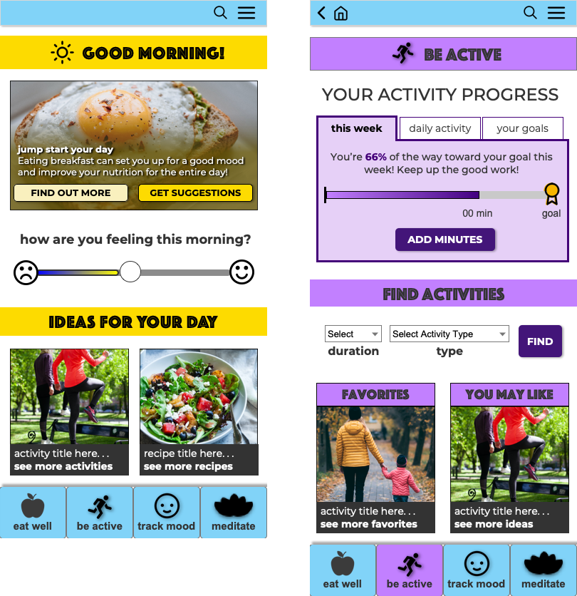
New prototype screens with updates informed by user test findings. Among other more prominent updates, the addition of a “Home” button in the top navigation bar (right) helps users more easily get to the home screen (left) from wherever inside the app they happen to be. The button was an easy and logical addition after all four user testers tried the back button first before looking in the hamburger menu to find a link to the home screen.
The Takeaway
Just because a formula is popular does not mean it works. People — intelligent, thoughtful, motivated people — will accept what is available to them, even to their own detriment, in the absence of something that truly meets their needs. It’s my job as a designer to demand more on behalf of the people who will use what I create. And the only way I know how to take an experience from acceptable to exemplary is to ask.


