Five minutes every day. One workflow. How big a difference could it make?
In working with a local school to assess, recommend, and prototype improvements to their enterprise student information system, I learned how something as simple as recording daily attendance had been turned upside down by the sudden and unexpected shift to distance learning in response to the COVID-19 crisis. For educators who are used to exercising resilience and resourcefulness even in the best of times, how could a little UX magic start off their day just a little bit brighter?
Role: Research, Design
Tools: Pen & Paper, G Suite, Zoom, Sketch, InVision
Methods: Cognitive Walkthrough, Contextual Inquiry, Affinity Mapping, Prototyping
The Big Picture
Client
Saint Thomas More School:
A private K-8 school in St. Paul, MN
Project
Evaluate and recommend customization improvements to the program’s enterprise Student Information System (SIS)
Recommendation
Improve learnability of dashboard navigation and more closely match attendance workflow to contextual conditions by improving visibility and mapping.
Assessing the Status Quo
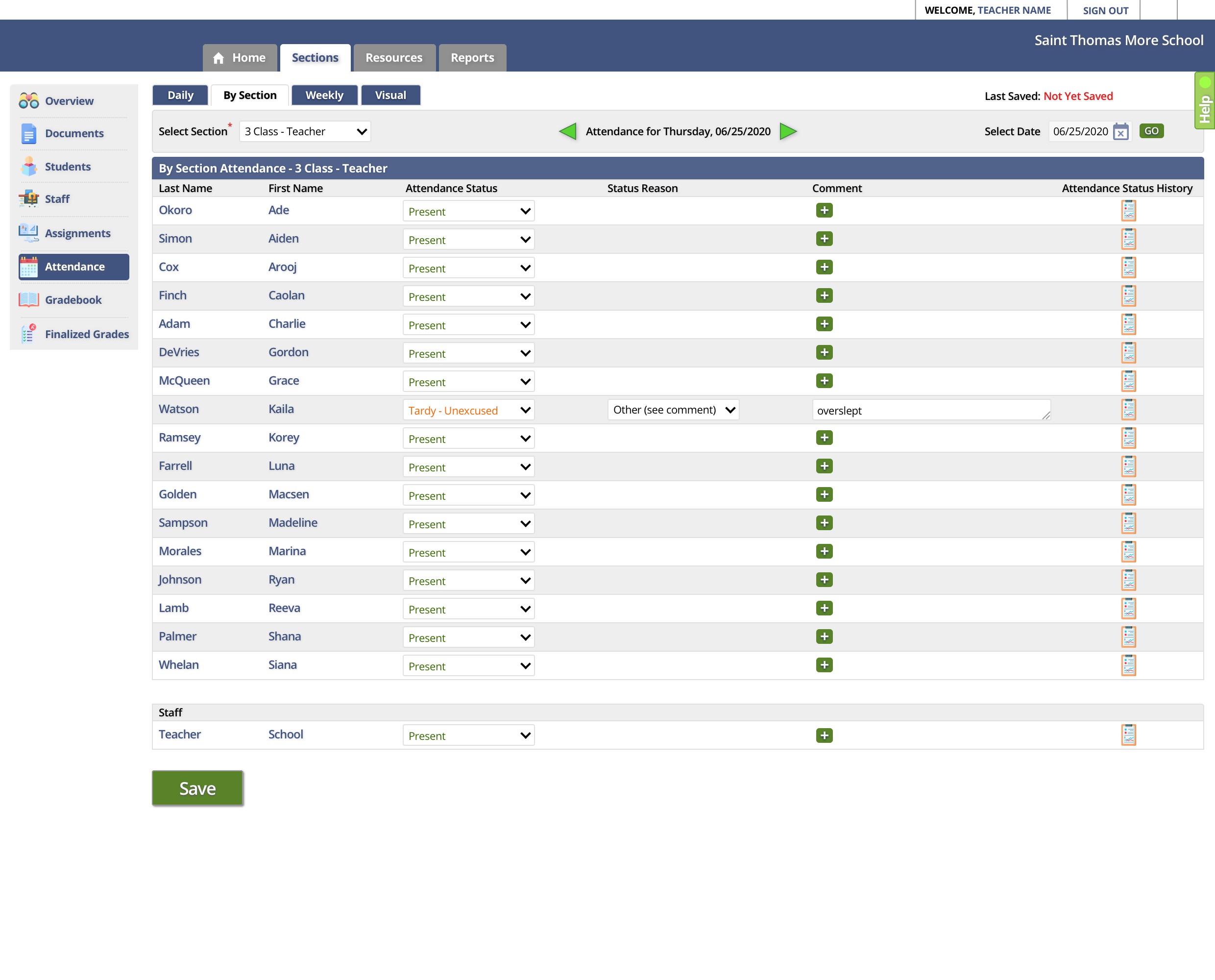
A cognitive walkthrough of the SIS revealed opportunities to improve mapping for a faster user flow.
Before hearing directly from users, I wanted to dive right in and give the school’s SIS system a whirl for myself and see if, through conducting a cognitive walkthrough, I could anticipate some user challenges and opportunities.
It was a process well worth the effort. Reviewing the findings, I became particularly concerned with mapping challenges, which I hypothesized would be difficult for new users to learn.
I knew that it was not unusual for enterprise software to come pre-loaded with a steep learning curve, but for busy teachers who need to focus their energy on students, there had to be a better option than spending the extra time clicking around trying to find the icon that represents the correct task flow.
Page examples from the cognitive walkthrough, showing a lot of areas of concern in the attendance workflow.
“I always forget which one that is.”
— User with 7 years of experience in the SIS choosing from coded attendance options during a contextual inquiry session
Moderating a remote contextual inquiry session with a teacher. During the session, the teacher described how the process of taking attendance had changed with the advent of distance learning. One factor had remained the same, however: attendance time was a hectic. Teachers only had a few minutes to submit attendance so that administrative staff could confirm and follow up with parents, but those minutes were also an important time for interacting meaningfully with students and setting the tone for the day.
Back to School: Learning from the Teachers
Through contextual inquiry sessions, I discovered gaps in how some SIS features had responded to changes in the learning environment.
With my completed cognitive walkthrough at the ready, I worked with a small team to develop a research protocol both for conducting and observing remote contextual inquiry sessions with school faculty and administrators. As a moderator, it was important to me to get a stronger sense of the user’s context when using the SIS..
Through these sessions, I learned that not only were many of my suspicions from the cognitive walkthrough correct, but there was a whole new layer of usability that I could not have anticipated if it had not been for the opportunity to see it for myself: when the classroom had moved online in response to the COVID-19 crisis, the attendance feature had stopped working for users. . . completely.

With the sudden advent of distance learning, teachers and administrators had determined that they needed to be more flexible with students. This flexibility resulted in taking attendance on a class-by-class basis rather than all at once at the beginning of the day. The SIS system, however, was not set up to accommodate this shift.
What was more, I was struck by how little the faculty and staff seemed to expect that to change. Instead of asking for the system to work for their needs, they had simply abandoned it in favor of their own tracking methods.
Planning a More Visible Road Map
Laying out an affinity map of research findings pointed to priority areas for workflow improvements.
As I reviewed and synthesized data from the user sessions, I noted the overall lack of training users received in the system model. Even those who expressed the greatest confidence with using it had reached points in their routine where they admitted that they simply didn’t know what certain features were for.
Though I could see many paths to improvement, I kept returning to the attendance tracking feature. The task had gone, almost overnight, from being the one flow that every user touched on a daily basis to the one that had become every teacher for themselves. . . everyone making it work however they could.
In scoping my prototype proposal, I determined that resolving the attendance tracking flow had to be the priority. Even though it was only a few minutes out of the day for most users, it was the one flow they all had in common, and therefore had the most to gain with the simplest adjustments.
Like the teachers and administrators we followed in our sessions, I had to find my own creative solutions when working from home. I used my sliding glass door as a white board to group to lay out an affinity map.
“Why is it this tiny button? . . . This is something that you do every day.”
— User expressing frustration about the obscure size and location of the dashboard icon that kicks off the attendance flow
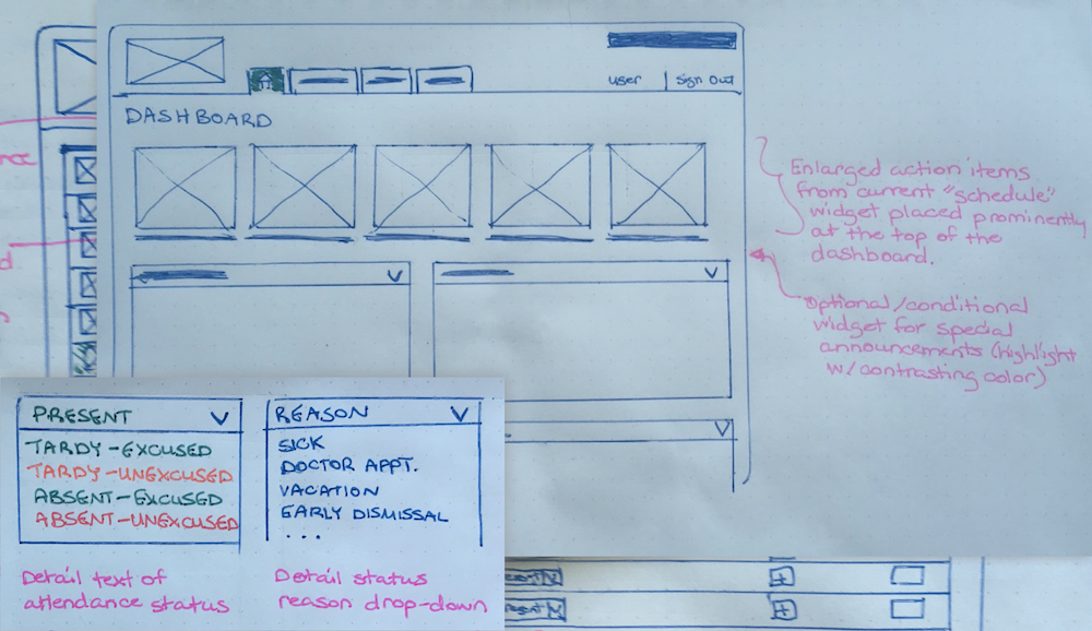
Hand-drawn wireframes of proposed changes to the SIS dashboard and several drop-down menus from the attendance workflow.
Visualizing the New Flow
Low-fidelity wireframes helped to lay out changes that wouldn’t require a sweeping overhaul.
As I began wireframes of the new attendance workflow, I considered the challenges involved in making even small changes to such a large system. Inevitably, seemingly innocuous adjustments to one screen could impact data and flows elsewhere in the system that were far outside the scope of my work. While I knew the school had the option to customize the SIS for their own needs, as just one school of many using the same software, it was unlikely that extensive revisions would be practical or even feasible.
With that in mind, I aimed to keep as much of the shell and its core components intact as possible. Getting my ideas out on paper first helped to suss out a few gaps in my proposed workflow so that I could fill them before moving on to the process of high-fidelity digital prototyping.

In improving the attendance flow, I considered the mapping challenges uncovered in my cognitive walkthrough and contextual inquiry sessions. Since users struggled to remember or understand what coded attendance options in dropdown menus meant , one easy fix was replacing them with clearly spelled-out options to remove any ambiguity.
I also increased the prominence of navigation icons throughout the flow. By placing them more prominently in the hierarchy and giving each a clear and always present label, users would no longer have to rely on their memory and precision clicking to get to where they wanted to go.
Signposts Down the Path
With improved mapping throughout the workflow, taking classroom attendance should be both easier to learn and faster to complete.
Throughout the attendance workflow, I made sure to address elements that clashed with the user’s mental model, and provided opportunities for additional visibility and feedback that would both guide new users and help them to avoid error. Most importantly, however, the proposed solution incorporated a “by class” attendance option and easy way to sort students by first name—the way they appeared in the digital classroom.
Although changes may not have appeared obvious at a glance, they were designed to make significant impacts. And for a teacher looking to spend their first minutes of class connecting with their students rather than a database or a spreadsheet, less could be the difference in achieving more.
Click above to watch the narrated video walkthrough of the prototype attendance workflow.
The Takeaway
The changes that improve a user’s experience don’t have to be extensive to be significant. Design doesn’t have to start from a position of overhaul. If we do our research and determine that making an icon bigger or changing a bit of microcopy is all it might take to solve a problem, then we can celebrate the achievement of making everyone’s life easier in the simplest possible way.
But just as simple solutions may prove to be the best, what is less simple is knowing what the most pressing problems are in the first place. Though we we will rarely have the luxury of being the user for whom we are designing, one advantage of being on the outside looking in is the ability to see the potential and ask for more than our users may ask for themselves.


